Analyzing US Coronavirus data (Apr 10 – May 10)
This week’s update of the coronavirus video provides insights into regions where there is a decreasing growth rate in new cases.
The two maps shown in this week’s video highlight the cumulative impact of the pandemic to date, as well as regional variations through the number of daily new cases per capita.
The map on the left shows the number of Confirmed Cases by US County. This map can be used to visualize how the cumulative impact of the coronavirus pandemic has impacted the country.
The map on the right shows Daily New Cases Per Capita by US county. Counties in yellow have 1 – 10 confirmed coronavirus cases per million, while areas with no color have less than 1 case per million. For developing planning scenarios, these areas may be of interest, as they are under the IMHE‘s suggested threshold of 1 infection per million to begin easing social distancing restrictions, while avoiding a resurgence of infections via active case detection and contact tracing.
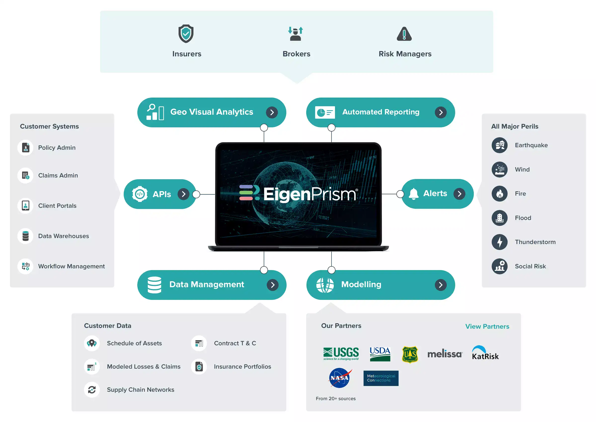
The map for Confirmed Cases Per Capita by US County is available in EigenPrism.
Impact Summary Report for EigenPrism Users:
EigenPrism users can also view all the US county level maps in the impact summary report:
- Open the impact summary report
- or, search for “SAMPLE Coronavirus Impact Summary – US County Maps” on the EigenPrism home page
- then click Manage > Copy to select your workspace and save with your own exposure.
Please note, as report templates are frequently updated, you can refresh the report by changing the Analysis Date. See instructions here.
Data-driven decision making to manage risk in real-time
To assess the pandemic risk, apply the geospatial layers over a schedule or portfolio of insured locations, or a listing of employees. The footprints are available for use in EigenAlerts, EigenProfile Impact Summary reports, and in Exposure Analytics for complete analysis.
- Daily updates
- Users can set Alerts for notifications (and view in the mobile app)
- Intensity value represents number of confirmed cases by best available resolution
Note: The reported confirmed cases are at the country, state/province & county level since 22nd Jan. Also, the reported resolution is of the highest level wherever possible.
Available to all in the EigenPrism free trial
These event sets are available to all in the EigenPrism free trial. Simply go to our login page and create a new account with your company email address. Please contact us if you can’t login and we will set up a free trial account for you.